How close is the Liverpool City Region to being 'overrun with sickness and death'?
The hunt for context amidst a lot of scary stories
Good morning - and welcome to The Post's first-ever email. It's about the latest Covid-19 data on Merseyside, and why we need to be a bit careful when we read scary newspaper stories about this outbreak.
First of all though, thanks for signing up so early on in this venture. The idea of The Post is to offer a different kind of local journalism in Merseyside, one that focuses on balance and nuance rather than sensationalism and chasing clicks. At the moment that means data-led reporting on the pandemic, but in future you will read great human features, politics stories and arts pieces from us too.
Initially, it's just a part-time project, so you might only hear from us every week or so. But if it grows a loyal audience because people like this style of journalism and tell their friends about it, then we will look at adding a paid subscription layer next year and hiring a full-time reporter.
For now, we have one request: If you think someone you know might find this newsletter useful, and might enjoy getting The Post regularly, please use the button below to tell them about it or post it on your social media.
At his press conference on Wednesday, Liverpool City Region Mayor Steve Rotherham told reporters that we are in a "very dangerous moment" and that there is "a real and present danger that our NHS could be overwhelmed." He also invoked some powerful medieval imagery to warn that if we don't follow the new Tier 3 rules, "The alternative is to see our city region overrun with sickness and death."
Liverpool City Region Mayor Steve Rotherham at last week’s press conference
What he didn't do is give us much data about quite how bad things are. How close are we to being overrun with sickness and death? How close to being overwhelmed are our hospitals? The emotion surrounding this outbreak is totally understandable, of course - people are dying every day, including the brother of the Liverpool city mayor Joe Anderson this weekend. We should honour those people by telling their stories.
But in addition to talking about those human tales, we also need clear data and facts, and news reporting that prioritises giving people the key bits of context they need. By context, I mean things like: How do Covid deaths now compare to April? And how does hospital capacity compare to last year? If you report the current numbers without those bits of context, you are in danger of alarming people and misleading them.
Over the weekend I started looking at the latest health data on deaths and hospitalisations, most of which is released by the NHS and Public Health England in a patchwork of different online spreadsheets which get updated at different times. I think they present a slightly more nuanced picture than some of the recent news reporting in this city has done, but I'll leave that up to you to decide.
It's not the job of journalists to browbeat you into taking Covid-19 seriously or to alarm you into action. It's our job to show you what is going on, to the best of our ability, so you have the best information at your disposal. If you have any questions about any of this analysis, please just post in the comments on our site or hit reply and ask me directly. And if you find it useful or informative, please send it to a few friends and tell them about The Post.
How many people are dying with Covid?
Across the Liverpool City Region, around 10 people are dying in our hospitals per day having been diagnosed with Covid-19. That’s the 7-day average of daily deaths up to last Thursday. It doesn’t necessarily mean all of these people are being killed by Covid, but it’s how the NHS records these numbers.
About two weeks ago, it was more like 5 people dying per day, and a month ago one person was dying every second day, so it’s rising in a concerning way. About half of these people are dying in the Liverpool University hospitals (Aintree University Hospital, the Royal Liverpool Hospital and Broadgreen Hospital), and they have been the focus of most of the news reporting recently.
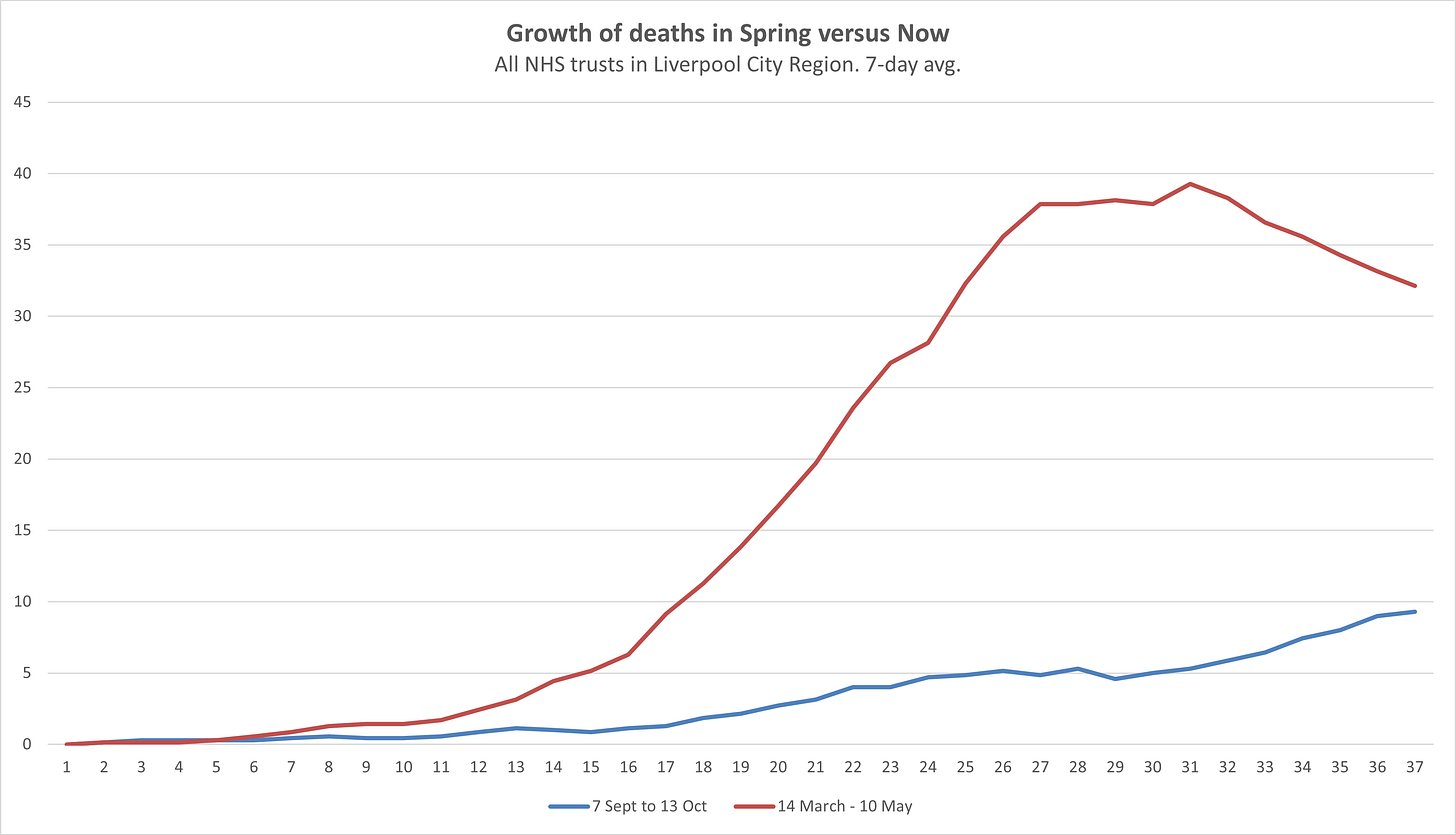
This graph shows how the deaths across the City Region now compare to the peak in April. As you can see, they are thankfully still much lower. In fact, from late March until mid-May, the average of daily deaths was higher than it is now, and at the peak in mid-April it was almost four times higher. So we are now at roughly one-quarter of the peak level of deaths in Liverpool City Region. That’s a crucial context to know when people are talking about things being “as bad as April” or “as bad as the peak”.
Looking forward, and especially because we are heading into the season when the NHS is always extremely stretched, it’s worth looking at how fast the death number is growing in the Liverpool City Region. Is the death number skyrocketing like it was in April? The answer is no. I’ve done this graph of how deaths have grown over the past 36 days versus how they grew in the 37 days before the peak. The red line is the period from 14 March, the blue one is the 37 days before last Tuesday.

In the Spring the number of deaths shot up from zero to a weekly average of almost 40 in the space of a month, whereas in the September/October period it grew about a quarter as fast. Is that necessarily a cause for celebration? No, because a gradual rise in deaths is still more and more deaths and it could reach that peak level soon. But again, it’s useful context, and a number that is rising slowly suggests that the number of people in really acute situations is also rising more slowly than it was before, which is good for hospitals and their ability to cope.
Are hospitals being overwhelmed?
This one is slightly more difficult to answer because the data around hospital occupancy isn’t as good as the data for deaths. But let’s start with something that probably isn’t true, and then say what we know is.
A week ago The Financial Times reported that Liverpool’s intensive care beds were “95% full”. Further down the story clarified that it was talking just about beds for patients not suffering from Covid, but the 95% figure was picked up widely. The next day councillor Paul Brant, the cabinet member for adult health and social care at Liverpool City Council, said intensive care beds were filling up “very fast” and told the BBC: "The most recent figures I've seen suggest they are over 90% full.” Again that was widely reported, including in the Echo.
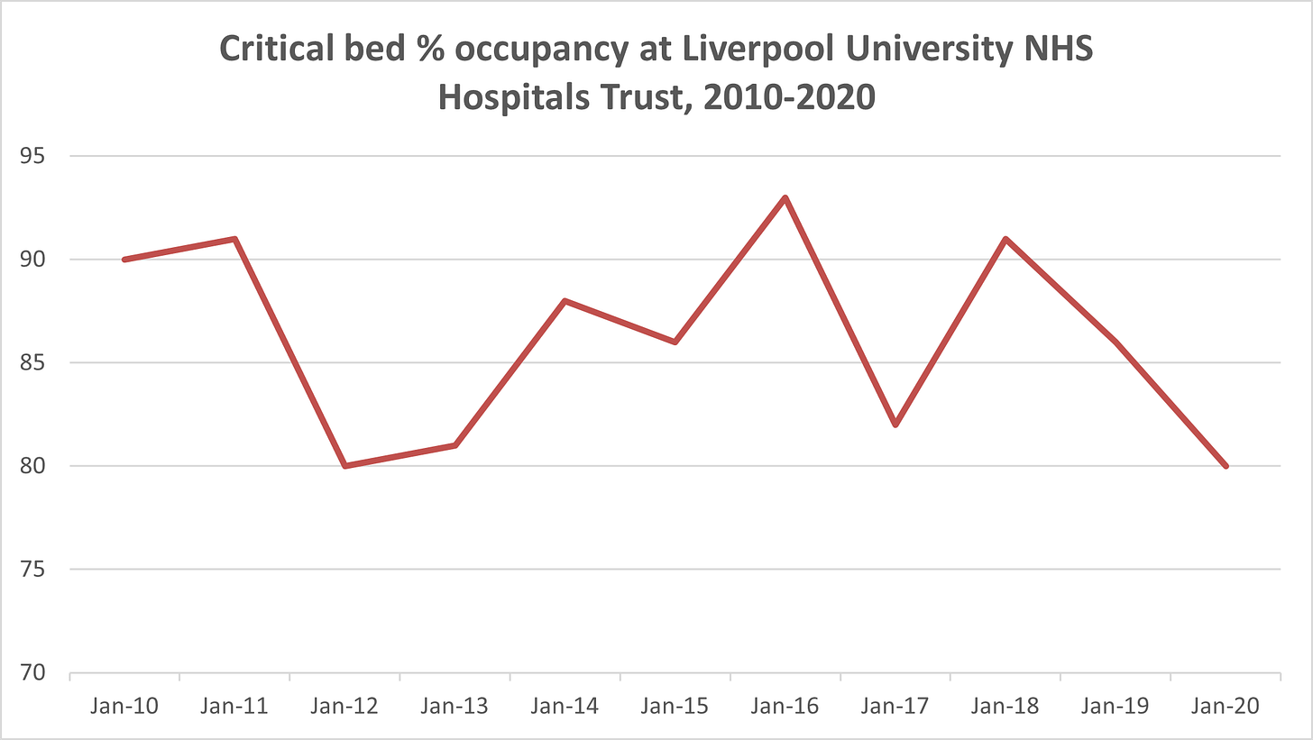
The crucial context missing from the reporting is that this time last year, Liverpool University NHS Trust had a critical bed occupancy of 86.4%. Most people don’t realise that ICUs are very often close to full, especially at this time of year and going into Winter. The Guardian did the same thing yesterday about Greater Manchester, mentioning a high figure for critical care occupancy without telling readers that it is currently lower as a percentage than the end of October last year.
The other issue is that the scary Liverpool figure was wrong. In fact, the university trust told The Mail its intensive care unit is only 80% full, with just 47 of 61 critical-care beds occupied, which is notably less full than the end of October last year. Obviously, the 95% number travelled much, much further than the subsequent denial, and none of the news reports I’ve seen has corrected the number.
Clearly the fact that our critical care wards usually operate so close to capacity is a huge worry, because it means a surge in Covid cases could very quickly fill them up. Here’s how the intensive care occupancy at the crucial trust looks over the past ten years (and remember that capacities change a bit year to year and October isn’t over yet this year).

What about general capacity in our hospitals, outside of just critical care wards. What you hear from doctors in Liverpool’s hospitals is that things are busier now than they were in April. That’s perhaps not surprising because in April the hospitals enacted a huge clearout of patients in order to prepare for a flood of Covid patients - so much that many doctors reported that they were sitting on their hands during the peak of the virus in the Spring. This time there hasn’t been a clearout, so you’d expect that the normal hospital population plus the growing Covid admissions would result in busier hospitals.
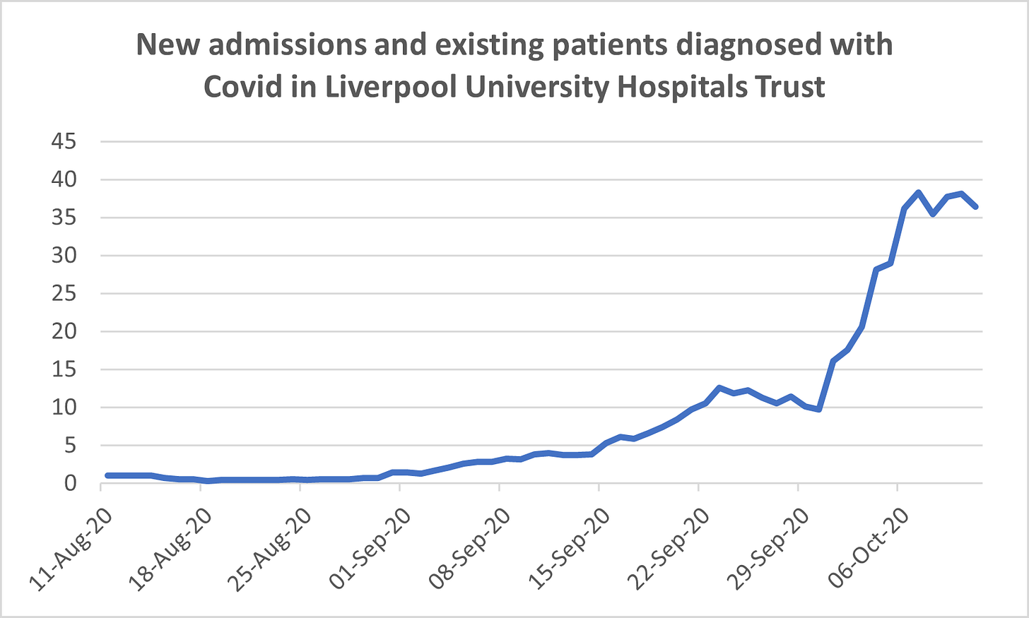
How fast are admissions growing? This graph shows that at the Liverpool University NHS Trust, based on NHS data that runs from August to October 11th. It combines Covid admissions and existing patients being diagnosed with Covid, and clearly shows a recent surge in the numbers. One Liverpool doctor I spoke to yesterday said this filling up of hospitals is a big concern, even if many of these people don’t end up needing mechanical ventilation coming close to death - because of the knock-on effect it has the capacity to help other patients. And of course, in a week many of these patients could be requiring ICU beds, causing a crunch there.

As far as I know, the NHS hasn’t released this data going back further than August (if I’m wrong about this, please email it over and I’ll report on it next week) so it’s hard to know how bad this spike is compared to the Spring. One figure I saw suggested there were about 60% as many Covid patients in the universities trust hospitals now as there were at the peak in April, but I haven’t got to grips with that data series so we might do something more on that next week, taking in the entire City Region rather than just the Liverpool hospitals.
Until then, stay safe and thanks for reading The Post.
Data notes:
Unlike Greater Manchester, the Liverpool City Region doesn’t neatly fit the geographic footprint of the NHS Trusts, so for the purposes of the deaths calculations I’ve included NHS Trusts that have some Liverpool City Region in them (like Cheshire and Wirral Partnership, Southport and Ormskirk and Warrington and Halton Teaching Hospitals) but aren’t all in the LCR. That means a small number of the deaths I’m attributing to residents of the LCR will actually be Lancashire, Cheshire etc.
Remember that health figures are not directly comparable from one year to the next because capacities of different wards change and policies around how to use certain beds can change too. This year there will be fewer elective procedures taking up beds and so on.
Any comments or feedback you have about any of this data, please just hit reply to the newsletter.


We are asked to focus on covid positive testing so much to drive our fear of this disease but maybe you need to report how covid tests are so inaccurate. They are pretty meaningless. Also best to look at excess figures of hospitalisations and deaths overall compared to previous years as we may see some flu cases getting reported this year as covid. Ivor Cummins analysis is good at explaining this.
Good luck with your venture!
You say in the post that ICU capacity is similar to last year but fail to mention that the hospital has opened up a further two ICU units to cope with demand. So that means the is more patients in these units it's just that the hospital has made more capacity for ventilator beds